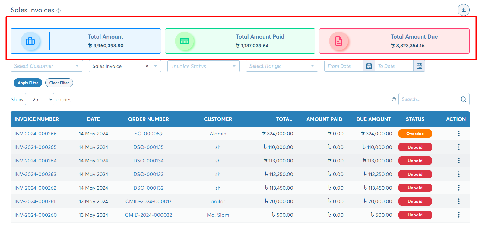
All time amount cards
The allTimeAmountCards component is utilized across various pages within the application to display the total amount of all time. It serves as a versatile component for showcasing data in different pages, including Sale Invoice List, Sale Orders List, Purchase Invoice List, Purchase Orders List, Payments List, Returns, and more. Here's an example of its usage:
Folder location:
- shared
- components
- all-time-amount-cards
- components
allTimeAmountCards.ts
Component Definition:
- The class name is
AllTimeAmountCardsComponent. - It has an
@Input()decorator for thedataListproperty, indicating that this property can receive data from its parent component.
- The class name is
Constructor:
- The constructor injects the
GlobalConstantsservice, which is presumably used within the component.
- The constructor injects the
export class AllTimeAmountCardsComponent implements OnInit {

  @Input() dataList: any = [];

  constructor(
    public _GLOBAL: GlobalConstants,
  ) { }

  ngOnInit(): void {
  }

  ngOnChanges(change: SimpleChange) {
    // console.log(this.dataList)
  }
}
allTimeAmountCards.html
In the HTML template:
- Skeleton Loader is shown if data is not available yet or
dataListis empty. - After the
dataListdata is available, we bind the icon, title, and amount after looping over the list. - Each element of
dataListis rendering a new card.
<div *ngIf="!(dataList?.length > 0)">
  <div class="row">
    <div class="col-lg-4 col-md-6 col-sm-12 mb-3">
      <ngx-skeleton-loader [theme]="{ width: '100%', 'border-radius': '5px', height: '65px', 'margin-right': '15px', 'margin-left': '' }" count="1"></ngx-skeleton-loader>
    </div>
    <div class="col-lg-4 col-md-6 col-sm-12 mb-3">
      <ngx-skeleton-loader [theme]="{ width: '100%', 'border-radius': '5px', height: '65px', 'margin-right': '15px', 'margin-left': '' }" count="1"></ngx-skeleton-loader>
    </div>
    <div class="col-lg-4 col-md-6 col-sm-12 mb-3">
      <ngx-skeleton-loader [theme]="{ width: '100%', 'border-radius': '5px', height: '65px', 'margin-right': '15px', 'margin-left': '' }" count="1"></ngx-skeleton-loader>
    </div>
  </div>
</div>

<div *ngIf="dataList?.length > 0" class="row">
  <div class="col-md-6 col-sm-12 mb-3" *ngFor="let data of dataList; let i=index" [ngClass]="{ 'col-lg-4': (dataList?.length == 3 || dataList?.length == 1), 'col-lg-3': dataList?.length == 4 }">
    <div class="amount-card" [ngClass]="data?.background">
      <div class="amount-card-icon-container">
        <div class="amount-card-icon">
          <nb-icon [icon]="data?.icon"></nb-icon>
        </div>
      </div>
      <div class="amount-card-info-container">
        <div class="amount-card-info">
          <div class="title">{{ data?.title }}</div>
          <strong class="text-nowrap">{{ _GLOBAL.CURRENCY_SYMBOL }} {{ data?.amount | number:_GLOBAL.AMOUNT_SHOW_FORMAT }}</strong>
        </div>
      </div>
    </div>
  </div>
</div>
Usage in parent component:
In the parent component's HTML or list page, the component block is placed above the table component, within a conditional statement. This block will appear if the table-data-details component are not being shown. Here is the code:
Example :<div *ngIf="!showDetails">
<biznify-all-time-amount-cards [dataList]="totalAmountData"></biznify-all-time-amount-cards>
</div>Here, the biznify-all-time-amount-cards component is utilized. The dataList property is bound to totalAmountData.
The totalAmountData is obtained from API calls such as getAllOrders and GetAllInvoices. After retrieving the data, another function called setTotalAmountCards() is invoked.
Here is the getAllDirectPurchase code block in purchase-direct-order-list.ts.
getAllDirectPurchase(){
  this.tableDataAllParam = {query:this.serverSideParameters, ...this.filterForm.value};
  this.subscription.add(
    this.directPurchaseService.getAllServerSide$(this.serverSideParameters, this.filterForm.value).subscribe(resp => {
      if (resp.succeeded) {

      //other codes here

      this.setTotalAmountCards(resp?.data);

       //other codes here

      }
    })
  )
}
Once the response is successfully obtained, we call the setTotalAmountCards() method.
Within the setTotalAmountCards() method, we populate the totalAmountData array. Each element in this array consists of properties such as icon, title, amount, and background.
These properties are assigned values to configure the appearance and content of each card. This method effectively prepares the data necessary for rendering the total amount cards.
Example :setTotalAmountCards(data){
this.totalAmountData = [
{
title: 'Sub Total Amount',
icon: 'briefcase-outline',
amount: data?.fullSubTotal,
background: 'blue'
},
{
title: 'Total Tax Amount',
icon: 'activity-outline',
amount: data?.fullTaxAmount,
background: 'red'
},
{
title: 'Total Discount Amount',
icon: 'percent-outline',
amount: data?.fullDiscountAmount,
background: 'green'
},
{
title: 'Grand Total Amount',
icon: 'plus-outline',
amount: data?.fullGrandTotal,
background: 'purple'
}
]
}